The Packaging Pickle
Why physical and digital retail shelves demand fundamentally different brand executions
Just how to stand out amongst the 40,000 products stocked by the average supermarket is a problem that is well understood - if not consistently well addressed - by the design conjurers of Big Brands the world over. Exhaustingly comprehensive volumes of work stand readily available with drawing-by-numbers guidelines on how to achieve visual cut-through, optimise value/size impression, unambiguously convey functionality, benefits and reasons to believe – and wrap the whole thing in packaging that is functional and intuitive to boot.
The woe for insurgent challenger brands is that most of the design rules that make packaged brands win on the physical shelves of Wal-Mart achieve the opposite on the digital shelves of D2C ecommerce. Similarly, attempting to stock even the most successful digital brands unchanged on physical retail shelves usually ends in tears. Digital challengers and physical retail brands require fundamentally different design languages for success – the contrasting principles of which need to be well understood and consciously leveraged by the ambitious challenger entrepreneur.
Context is everything
Great design never exists in isolation, but always in context: the setting in which consumers discover a product, consider its merits, weigh its value – and either buy it, or leave it. Consumers never encounter brands in the white-washed board rooms of design agencies, mounted onto handsome presentation boards and to the soundtrack of a rousing voice-over. Products are discovered and judged in context, and for physical packaged brands this is the cold, unruly shelf of a supermarket aisle, stacked tightly side by side with all competitors.
Great physical packaging and brand design is consequently first and foremost a comparative challenge, and physical brands win the retail shelf war by drawing consumers in from far (scanning the aisle) to near (product in hand), with a 4-step signalling hierarchy that purposefully goes from big to small:
Step one is to achieve visual cut-through from 6 feet distance against the competitor products on the shelf. Packaging shape, colours and the impact of branding recognition and differentiation all play their part - and the extent to which brashness or subtlety win is a question of the comparative set in the category itself. Step two is to reassure on value through size impression from 4 feet, again in comparison to the immediate competition. Step three brings the consumer to within 2 feet, with text to list the specific claims and benefits of the particular product to differentiate it from its rivals and to navigate variants. Step 4 details reasons to believe those claims – with information on ingredients, formulation, provenance or other, typically listed in much smaller print that can only be read comfortably after picking up the product and holding it directly in hand. By this point, the discovery battle has essentially been won: the consumer has been drawn in from 6 feet distance against a myriad competitors, to holding one package in hand.
Physical brands that succeed on shelf understand that winning requires designs that are bold and reductive at the same time: bold to achieve stand out, and reductive because there is neither the time nor canvas for complex storytelling.
The opposite is true of digital brands.
If the context of a physical brand is the crowded and reductive retail shelf, the context of digital brands is space, focus, and an abundance of rich media. Successful digital brands gain the attention of consumers not through visual cut through of their packaging from 6 feet, but through the relevance and poignancy of their storytelling, in the context of content consumption by the intended consumer group. Here the digital page and its media are the canvas, not the product pack itself. Moreover, the consumer can’t be drawn in closer – meaning there is no point in following the conventional information hierarchy of big to small on the product. Instead, digital brands succeed by telling their story through imagery – leaving the detail to the medium and not to small print on the pack.
Two brands to make the point
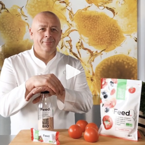
To highlight the difference, consider two young challenger brands: Huel and Feed. Both are essentially the same product: powder-based meal replacements, offering an inexpensive, convenient and sustainable alternative to conventional food. The two brands are indistinguishable from each other in terms of features, benefits and reasons to believe. Yet Huel has been a staggering runaway success in digital D2C, whereas Feed has failed to gain much traction digitally, and is instead relying on growing through physical sales on 3rd-party retail shelves. Perhaps unsurprisingly given the power of the internet for challenger brands, Huel is nearly 5x bigger than Feed.

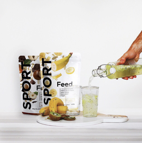
Intentionally or not, Feed’s packaging is optimised for physical shelves, with a conventional information hierarchy going from far (flying strawberries and chunks of banana), to near (claims, benefits and reasons to believe). It works in a store, but it is cluttered and illegible on a web page.

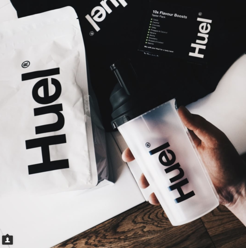
Huel in contrast has nothing written on its packaging other than the brand itself, and it relies on the context of the digital media on the web page to convey its story. The difference in brand execution for impact is striking. The berries on Feed’s packaging disappear visually in the image. Huel instead can place them front and centre.
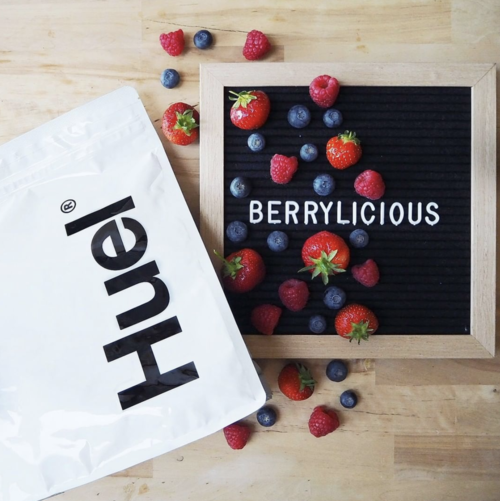
Huel’s stark and minimalist brand and packaging design is optimised for digital, relying on the page and imagery to deliver the required storytelling. It wouldn’t work in a supermarket. Feed’s packaging design is optimised for physical retail shelves, relying on the conventional information hierarchy to draw consumers in. It fails on Instagram.
Of pegs and holes
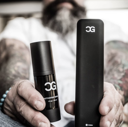
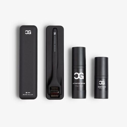
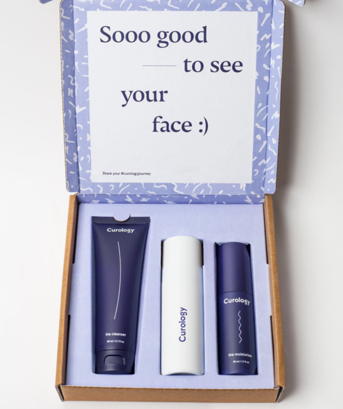
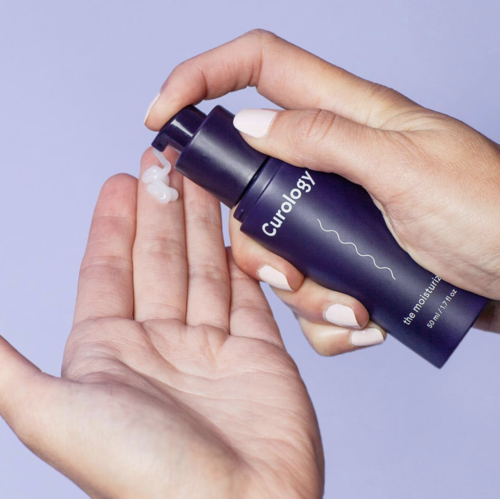
Considered through this lens, the playbook for successful digital-first challenger brand executions becomes apparent everywhere: take Copenhagen Grooming’s visually arresting black-and-white toolkit for bearded men, or Curology’s personalised acne skincare – these are type examples of digital-only brands enjoying stellar growth thanks to brand and packaging that focuses on simplicity on pack and rich storytelling in context.
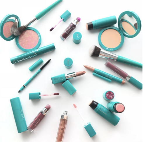
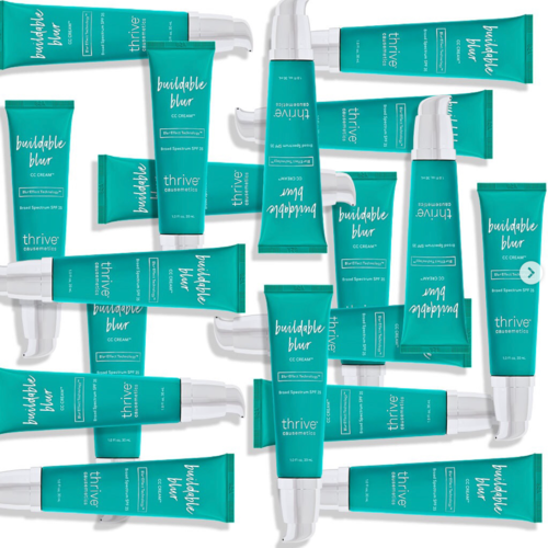
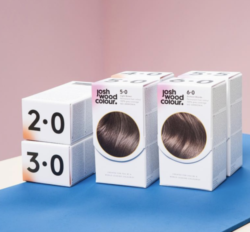
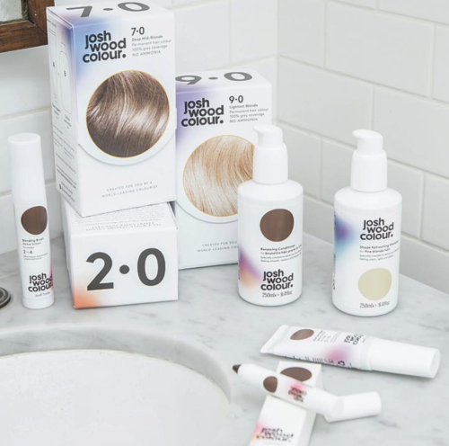
In contrast, Thrive Causemetics and Josh Wood Colour are two fledgling challenger brands with executions that follow the physical retail logic and hence have a harder time digitally: the brand on Thrive’s packaging is invisible on a mobile feed, and the product hierarchy of Josh Wood’s range is unintelligible without holding the box in hand.
Inevitable multichannel complexity
While the model for D2C brands is becoming clear, regrettably life gets much more tricky for challengers looking to expand their footprint from digital-only to multichannel, and hence tackle the dreaded retail shelf. Because digital success doesn’t translate into physical success - a sobering example of which is offered by the organic tampon brand Cora. The beauty of Cora’s simple and elegant design language made them early stand-outs in the digital challenger line-up to Tampax and Playtex’s Big Brand hegemony. The screen grabs of Cora’s striking digital brand execution compared to Tampax’s overloaded and busy packaging failing on Instagram speak for themselves.
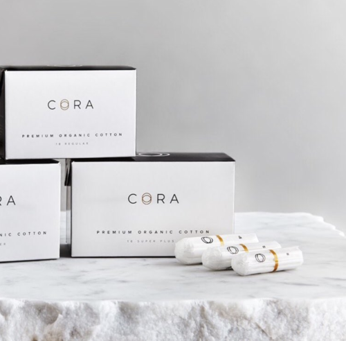


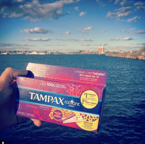
However, Cora’s cut-through as a clean digital brand simply doesn’t translate when placed on a busy shelf at Target – thereby highlighting the inevitable conclusion that great physical and digital brand executions really are like oil and water.

Bringing it all home
The challenger revolution in consumer goods is disrupting staid categories with remarkable speed. Fledgling ventures don’t get to beat Unilever by playing to Unilever’s rules, however, and that means that the successful operating model for the insurgents is markedly different from that of conventional FMCG. This is apparent across all aspects of the value chain: from supply chain and distribution, to brand design, marketing, pricing – and even humble packaging. For focused D2C players, the benchmark for stand-out brand and pack design is becoming clearly apparent. The stark difference in the required physical vs digital approach, however, means that for challengers going multichannel, a distinctly unwelcome layer of complexity presents itself: how to square the circle between physical and digital?
A number of potential solutions offer themselves:
Single-channel brands could ignore or not worry too much about the other channel - a defeatist idea if this is only done to make packaging life easier.
They could have two different designs for physical and digital retail – though this would create two separate SKUs and plenty of undesirable complexity.
They could bite the bullet and develop a cunning new design language which works in both environments. Some cheats might help, e.g. ‘front 1’ for physical and ‘front 2’ for D2C, or have an inner package for D2C and ads, and an outer for on-shelf in physical.
Or, perhaps ideally, they could take it a step further and link SKUs to channel strategy - consciously listing different products in the different channels, with varying pack sizes or even specification and features.
The optimal multichannel solution will doubtless emerge in the coming months and years. At The Craftory, we’ll keep a watchful eye on the developments. All the way down to how to package pickles.
Ernesto Schmitt is co-founder at The Craftory, the brand-new counter-corporate anti-VC on a $300M mission to back the world's boldest insurgent challenger brands in the consumer goods space.